CSV Plot: easy and powerful plotting tool for CSV files


![]()
What is it?
CSV Plot is a tool to easily plot any CSV file, of any size, without ever running out of memory. (Only data which is displayed on the screen is loaded into memory.)
It works with user friendly YAML configuration files, to let you choose the layout, colors, units, legends…
CSV Plot is built on top of the amazing PyQtGraph library, which ensures a nice and smooth experience, as plotting should always be.
Installation
A already installed C compiler is needed to install csv-plot, else the installation
will fail. To know how to install a C compiler on your system, go to Installing a C
compiler section at the end of this document.
$ pip install csv-plot
Complete tutorial
Introduction
CSV Plot is based on two main elements:
- A CSV file (contains what you want to plot)
- A configuration file (contains how do you want to plot it)
The simplest possible example
Here we go
Download the file example_file.csv.
This CSV file contains 1.000 rows of 5 columns:
indexsincossin_randcos_rand
Copy the following content in a file called configuration-1.yaml.
general:
  variable: index

curves:
  - variable: sin
⚠️ Don’t forget the - in the curves section. We’ll explain why it’s needed after. ⚠️
Then write
$ csv-plot <path-to-csv-file> -c <path-to-configuration-1.yaml>
Here we are, you get your first shiny plot!
- To move, keep left mouse button pressed then move the mouse.
- To zoom:
- keep right mouse button pressed then move the mouse, or
- use the middle mouse wheel.
- To reset, click on the
Abutton on the bottom left of the window.
You can also right click to discover all the available options.
You can type
$ csv-plot --help
to get help on the available options.
Explanation of the configuration file
- The
general/variablevalue indicates which column is used as abscissa (hereindex) - The
curve/variablevalue indicates which column is used as ordinate (heresin)
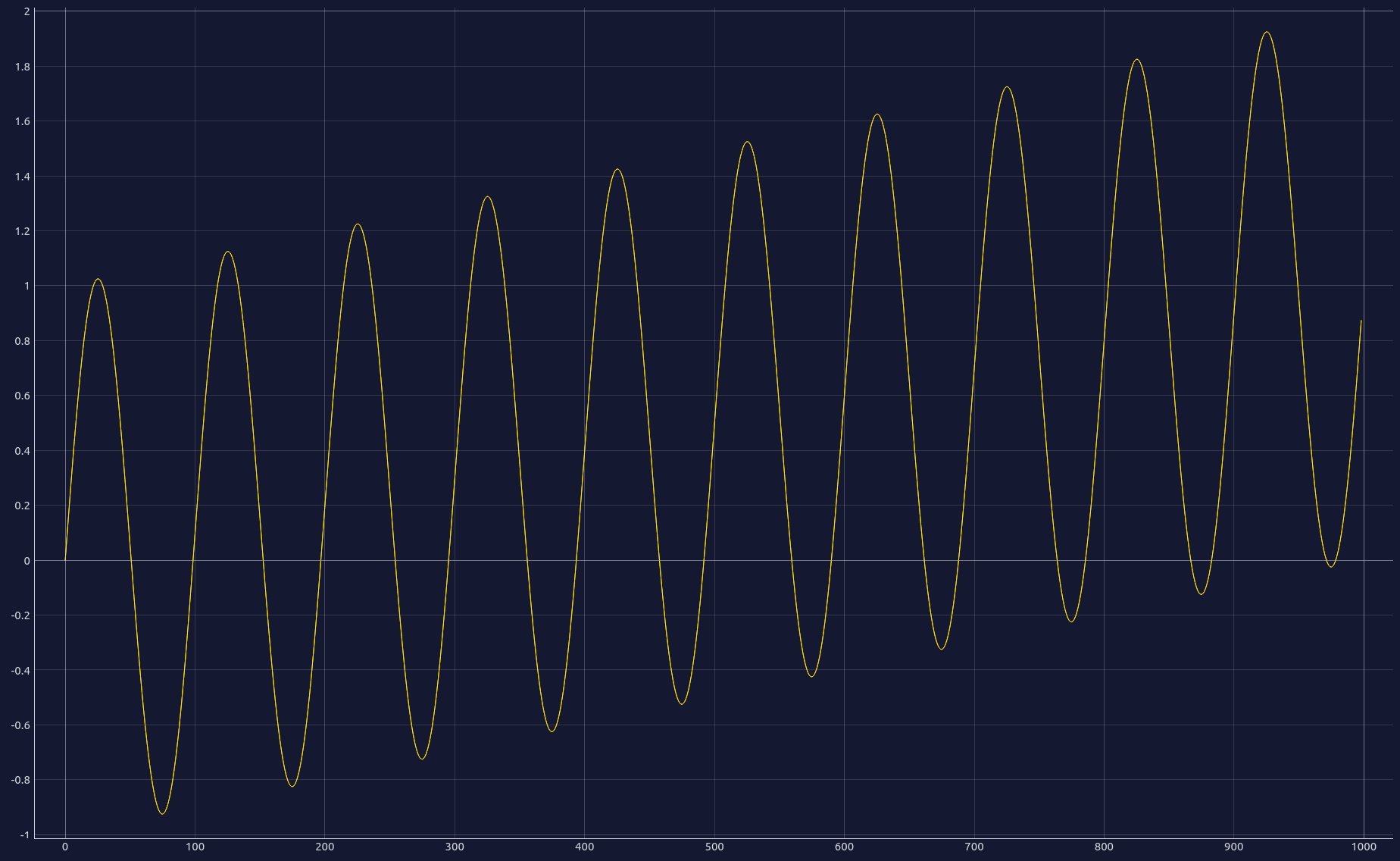
Two curves on the same plot
Here we go
Copy the following content in a file called configuration-2.yaml.
general:
  variable: index

curves:
  - variable: sin

  - variable: cos
    color: green
Then write
$ csv-plot <path-to-csv-file> -c <path-to-configuration-2.yaml>
Explanation of the configuration file
You see two curves. sin is in yellow, cos is in green. If no color is specified,
CSV Plot defaults to yellow.
Here is the list of available colors: aqua, black, blue, fuchsia, gray,
green, lime, maroon, navy, olive, orange, purple, red, silver, teal,
white & yellow.
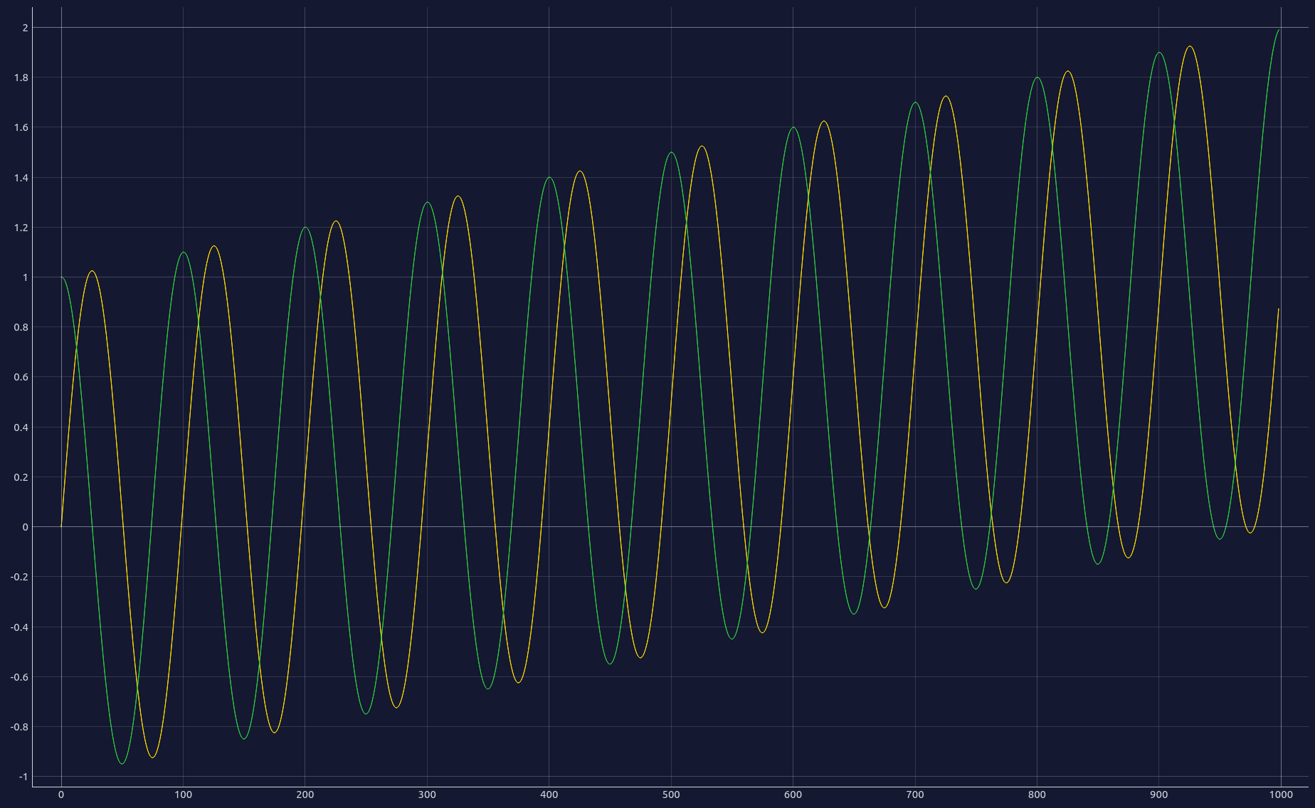
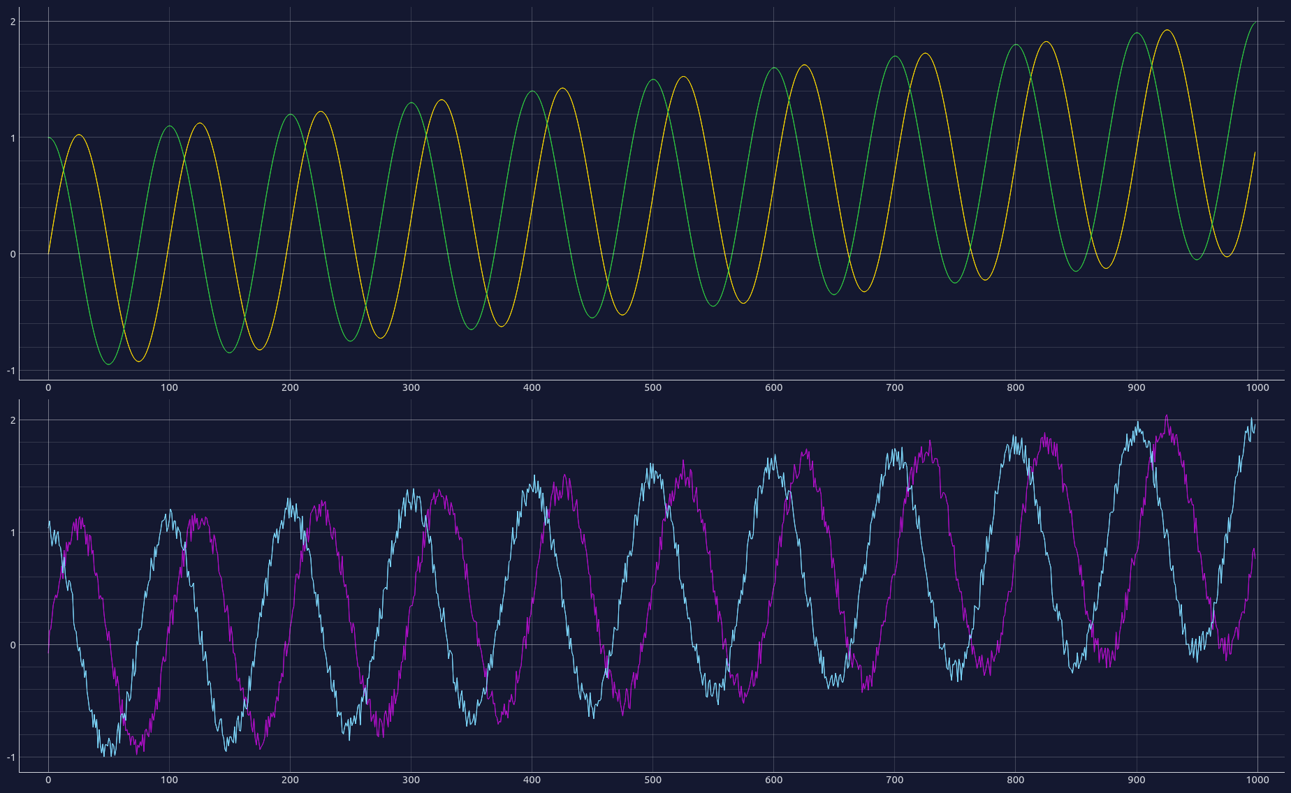
Multiple sub plots
Here we go
Copy the following content in a file called configuration-3.yaml.
general:
  variable: index

curves:
  - variable: sin
    position: 1-1

  - variable: cos
    position: 1-1
    color: green

  - variable: sin_rand
    position: 2-1
    color: purple

  - variable: cos_rand
    position: 2-1
    color: aqua
Then write
$ csv-plot <path-to-csv-file> -c <path-to-configuration-1.yaml>
Explanation of the configuration file
You see 4 curves. Additionally to the previous example, we added for each curve the
position item. This item is composed of <number>-<number>.
- The first
numberrepresents the row of the subplot. - The second
numberrepresents the column of the subplot.
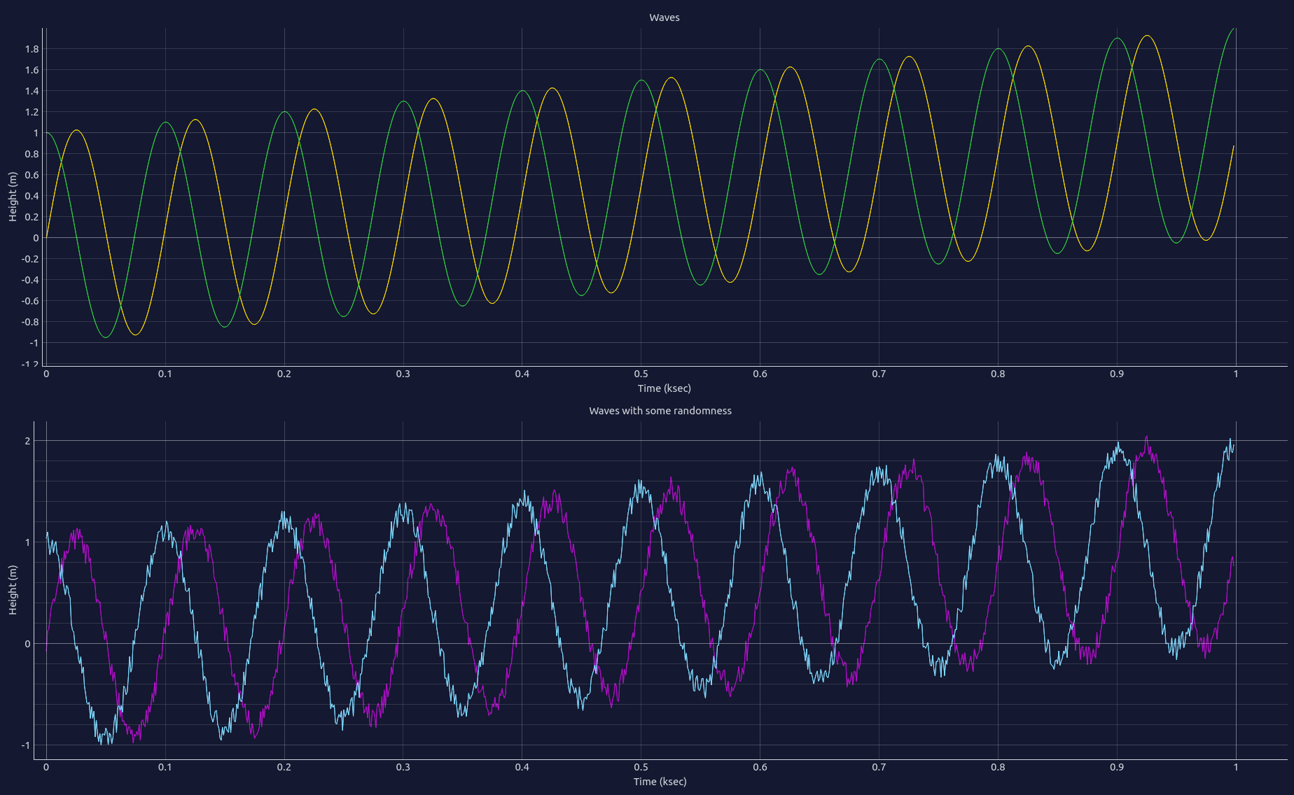
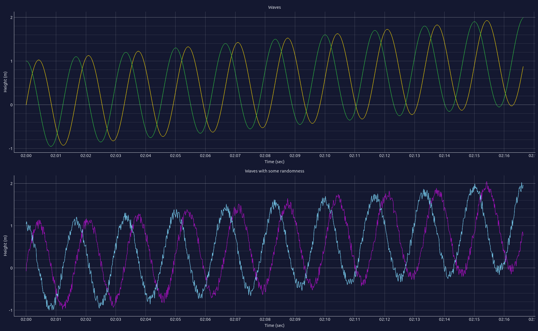
Adding titles, labels and units
Here we go
Copy the following content in a file called configuration-4.yaml.
general:
  variable: index
  label: Time
  unit: sec

curves:
  - variable: sin
    position: 1-1

  - variable: cos
    position: 1-1
    color: green

  - variable: sin_rand
    position: 2-1
    color: purple

  - variable: cos_rand
    position: 2-1
    color: aqua

layout:
  - position: 1-1
    title: Waves
    label: Height
    unit: m

  - position: 2-1
    title: Waves with some randomness
    label: Height
    unit: m
Then write
$ csv-plot <path-to-csv-file> -c <path-to-configuration-4.yaml>
Explanation of the configuration file
We just added general/label and general/unit. These 2 values add label/unit of the
x axis (bottom of plots)
We also added the layout section.
For each sub-plot:
positionindicates the position of the sub-plot.labelandunitadds label/unit of theyaxis of the subplot (left of sub-plot)titleadds a title for the sub-plot (top of sub-plot)
Using abscissa as dateTime
Here we go
Copy the content of the file configuration-4.yaml, and copy it in a file named
configuration-5.yaml. In the general section, add datetime: true, so it looks like
it:
general:
  variable: index
  label: Time
  unit: sec
  asDateTime: true
The x axis contains now dateTime instead of integers. If asDateTime: true is set, then
the general/variable will be considered as the number of seconds since the 1st January 1970.
Using configuration directory instead of configuration file
Move all you previously created configuration files (configuration-<x>.yaml) into a
directory named csv-plot-configuration. You will have something like:
csv-plot-configuration
|
|- configuration-1.yaml
|- configuration-2.yaml
|- configuration-3.yaml
|- configuration-4.yaml
|- configuration-5.yaml
Then write
$ csv-plot <path-to-csv-file> -c <path-to-csv-plot-configuration-directory>
CSV Plot will automatically detect which configuration files are suitable with the CSV file. If it detects several suitable configuration files (like in this example), then CSV Plot will ask you which one do you want to use. (If there is only one which is suitable, then CSV Plot will use it without asking.)
You can also mix multiple configuration files and/or multiple configuration directories:
$ csv-plot <path-to-csv-file> -c <path-to-one-csv-plot-configuration-file> \
-c <path-to-another-csv-plot-configuration-file> \
-c <path-to-a-csv-plot-configuration-directory>
Using default configuration directory
If you don’t want to specify each time the path of your configuration file or configuration directory, you can do:
$ csv-plot --set-default-configuration-directory <path-to-csv-plot-configuration-directory>
You can now write:
$ csv-plot <path-to-csv-file>
without having to specify the -c option.
Unleash the full power of CSV Plot
Until now, we only used a tiny file containing 1.000 lines. The true power of CSV Plot is to handle files of millions or event billions lines very smoothly, and without getting any “Out of Memory” error.
Download and unzip this file.
It contains all historical data (trade by trade) for the cryptocurrency pair ETH-USD on Coinbase between in May 2017 to June 2021.
This file contains about 129 millions of lines (that’s a lot!).
Here are the first lines of this file:
time,trade_id,price,side,size
2016-05-18 00:14:03.60168+00,1,12.5,sell,0.39900249
2016-05-18 00:25:04.8331+00,2,12.5,sell,0.60099751
2016-05-18 00:25:04.833469+00,3,13.0,sell,0.18943026
2016-05-18 00:36:37.07255+00,4,12.75,sell,0.58911544
2016-05-18 00:38:52.981904+00,5,12.75,sell,4.41088456
2016-05-18 00:38:52.982089+00,6,13.0,sell,0.31056974
In the default configuration directory you created in the previous part, copy the
following content in the file crypto-1.yaml:
general:
  variable: trade_id
  label: Trade ID

curves:
  - variable: price
    position: 1-1

layout:
  - position: 1-1
    label: Price
    unit: USD
Now run:
$ csv-plot <path-to-csv-file>
CSV Plot will process the file. This could take up to 3 minutes, depending of your computer. This processing part is done only once. The next time, curves will be displayed instantly.
Notice that CSV Plot did not asked you which configuration file to use, despite of the fact there is multiple files in the default configuration directory. CSV Plot automatically detected that only one configuration file suits the columns of the CSV file, so it chose it.
Once the processing part is done, you can move and zoom very smoothly on this 129 millions of points curve.
Parsing datetime
The file we used in the previous section contains a time column. This column
represents a datetime. To use it, we have to tell CSV Plot how to parse it.
In the default configuration directory you created in the previous part, copy the
following content in the file crypto-2.yaml:
general:
  dateTimeFormats:
    - "%Y-%m-%d %H:%M:%S.%f+00"
    - "%Y-%m-%d %H:%M:%S+00"
  variable: time
  label: Date
  asDateTime: true

curves:
  - variable: price
    position: 1-1

layout:
  - position: 1-1
    label: Price
    unit: USD
Now run:
$ csv-plot <path-to-csv-file>
Here, 2 configuration files are suitable for the CSV file, so CSV Plot asks you to choose which one do you want to use.
In the configuration files, the dateTimeFormats section contains a list of date time
formats. Suitable formats correspond to the Python function
strftime.
Usually, all datetimes of the CSV file match with the same format. If it is not the case, you can specify multiple formats (like in this example).
Be careful: CSV Plot will always try to match formats in the same order than in this configuration file, and will stop to the first which works. Put the format which is likely to be the more common first, so plotting experience will be smoother.
Remember: The asDateTime value determines if the x axis should be represented in
seconds since the 1st Janurary 1970 or in plain text. Usages of asDateTime and
dateTimeFormats are totally independent.
Installing a C compiler
On Ubuntu
$ sudo apt update && sudo apt install build-essential
On Mac OS
- Install homebrew if not already done
$ brew install gcc